The Conference Dashboard (also known as AIDA Dashboard) is a tool for exploring and making sense of scientific conferences which integrates statistical analysis, semantic technologies, and visual analytics. The dashboard was developed in collaboration with Springer Nature for assisting editors in assessing conferences, but it also supports several other use cases. Compared to other state-of-the-art solutions, it introduces three novel features. First, it associates to conferences a very granular representation of their topics from the Computer Science Ontology (CSO) and uses it to produce several analytics about its research trends over time. Second, it enables to easily compare and rank conferences according to several metrics within specific fields (e.g., Semantic Web) and timeframes (e.g., last five years). Finally, the dashboard offers several features for assessing the involvement of industry in a conference. This includes the ability to focus on companies and their performance when assessing organizations, to report the ratio of publications and citations from academia, industry, collaborative efforts, and to distinguish industrial contributions according to 66 industrial sectors (e.g., automotive, financial, energy, electronics) from the Industrial Sectors Ontology (INDUSO).
The Conference Dashboard builds on the Academia/Industry DynAmics knowledge graph (AIDA), a large knowledge base describing 14M articles and 8M patents in the field of Computer Science according to the research topics drawn from CSO. 4M articles and 5M patents are also classified according to the type of the author’s affiliations (academy, industry, or collaborative) and 66 industrial sectors drawn from INDUSO, which was specifically designed to support AIDA. AIDA was generated by integrating several knowledge graphs and bibliographic corpora, including Microsoft Academic Graph (MAG), Dimensions, DBpedia, CSO, and the Global Research Identifier Database (GRID).
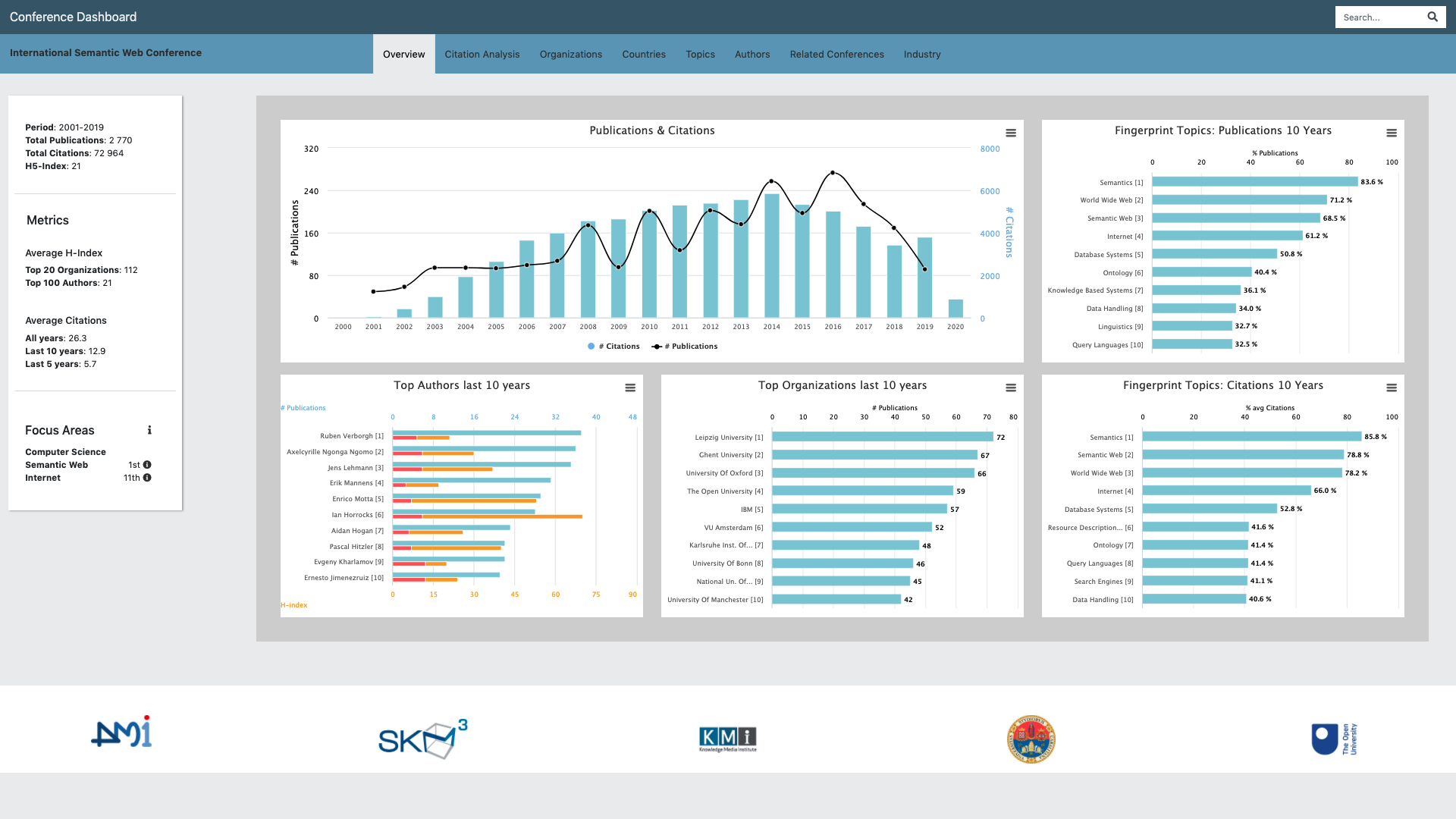
The dashboard is a highly scalable web application and allows to browse the different facets of a conference according to eight tabs, as showed in Figure 1: Overview, Citation Analysis, Organizations, Countries, Authors, Topics, Similar Conferences, and Industry.

Figure 1 shows the Overview tab. This is the main view of a conference that provides introductory information about its performance, the main authors and organization, and the conference rank in its main fields in terms of average citations for paper during the last five years.
The Citation Analysis tab reports the evolution in time of several citation-based metrics such as the impact factor and the average citations for paper. It also shows the evolution of the rank and the percentile of the conference in different fields. This visualisation is typically used by Springer Nature editors to assess the performance of conferences within different communities and to identify emerging conferences.
The Organizations and Authors tabs show several analytics about the main institutions and researchers active in the conference. Organizations can be filtered according to their type (academia or industry) and are associated with their number of publications, citations, and average citations for paper. The researchers are associated with similar analytics, but also with their H-index and H5-index, in order to quickly identify high impact researchers. Editors use this information to understand the quality of researchers and organizations attracted by the conferences. This is particularly important for assessing relatively young conferences that may not have developed yet a strong citation record.
The Countries tab shows the geographical distributions of the authors who published at the conference, including the countries who mostly cited such published papers. Editors can use this information to understand how good the conference is in attracting international authors, as well as whether the content it published has an international impact.
The Topic tab allows users to analyse the topic trends in time. Specifically, it shows two selections of topics: frequent topics and fingerprint topics. The first is the set of topics which appear more frequently in the conference. The second is the set of most distinctive topics of the conference. It is obtained by computing the difference between the topic distribution of the conference and the ones of the full dataset.
The Related Conferences tab compares the conference under analysis with all the other conferences in the same fields according to their number of publications, citations, and average citations for paper. The user can contextualise the comparison to different fields. For example, ISWC can be compared with all the other conferences in the fields of Semantic Web, Internet, or Computer Science.
Finally, the Industry tab reports the percentage of publications and citations from academia, industry, and collaborative efforts as well as the industrial sectors analysis. The latter shows the percentage of produced publications and citations received by companies in different sectors. For instance, the main industrial sectors of ISWC are Computing and IT, Information Technology, Management, Telecommunication, and Health Care.
Related Links
Related Publications
- Simone Angioni, Angelo Antonio Salatino, Francesco Osborne, Diego Reforgiato Recupero, Enrico Motta The AIDA Dashboard: Analysing Conferences with Semantic Technologies. In (ISWC 2020 Posters & Demonstrations and Industry Tracks) @ The Semantic Web – ISWC 2020, 2-6 November 2020, Athens, Greece, CEUR Workshop, 2020
- Simone Angioni, Angelo Antonio Salatino, Francesco Osborne, Diego Reforgiato Recupero, Enrico Motta Integrating Knowledge Graphs for Analysing Academia and Industry Dynamics. In ADBIS , TPDL and EDA 2020 Common Workshops and Doctoral Consortium, pp. 219-225. Springer, 2020



 Scholarly Knowledge Mining
 Digital Humanities
 Data Science
 Smart Cities and Robotics
You must be logged in to post a comment.